The Importance Of Mobile Optimisation

People’s interactions with your business or website evolve over time, and in the current digital environment, it is very typical for a mobile phone to be the most convenient way to access it. In today’s digital landscape, mobile optimisation is a must rather than an option. Making sure your website is mobile-friendly is more important than ever in order to improve user experience, conversions, and search engine results since mobile devices make up the bulk of internet traffic. For more information on the advantages of mobile optimisation, continue reading, as now is a better time than ever to start your mobile optimisation journey!

Mobile optimisation is the act of improving your website so that it works properly and effortlessly on devices like smartphones and tablets. A mobile-friendly website can adapt to any screen size, loads faster and more effectively, and offers a user-friendly experience.
Users may struggle to browse a website that is hard to use on a mobile device, which could prevent them from finding the information they need or from completing an action they want to take. Poor mobile usability of this kind can cause consumers to leave the website, which lowers conversion rates. According to HubSpot, 73.1% of web designers think that one of the primary reasons users choose to abandon a website is a non-responsive design. Having a smooth, clear mobile experience is a must since it increases user engagement and boosts conversion rates.
Optimising your website to make it easier for visitors to find what they need is the first step towards improving the user experience. Developers should concentrate on optimising loading times because they can improve mobile SEO. A straightforward layout and easy navigation are also crucial because they keep visitors on your website longer. 55.4% of internet users make purchases online using their phones, according to HubSpot, therefore it’s critical to make investments in mobile optimisation to enhance user experience and facilitate easy purchasing. A well-optimised website can keep users engaged and help to drive more traffic, all whilst boosting sales, especially amongst the 55.4% who frequently shop online using their mobile.
A well-optimised mobile site attracts more users and keeps them engaged. According to Google, mobile-friendly websites rank higher in search results, making them easier to find and driving more traffic. If you haven’t invested in mobile optimisation yet, now is the perfect time to start improving visibility and user engagement.
Google prefers mobile-friendly websites in its rankings since mobile-first indexing is now the norm, which, when optimised, can increase your visibility. Making your website mobile-friendly is critical if you want to boost the possibility of it appearing higher in search engine results, and you must ensure that it is maintained with regular checks to keep traffic flowing.
When you have a well-optimised website, it provides you with an advantage over competitors who may not have the same, or a mobile website as optimised as yours. Failing to optimise your website puts you at a disadvantage as visitors are 5 times more likely to leave, according to Google. Stand out in your industry and meet modern customer expectations with mobile optimisation!
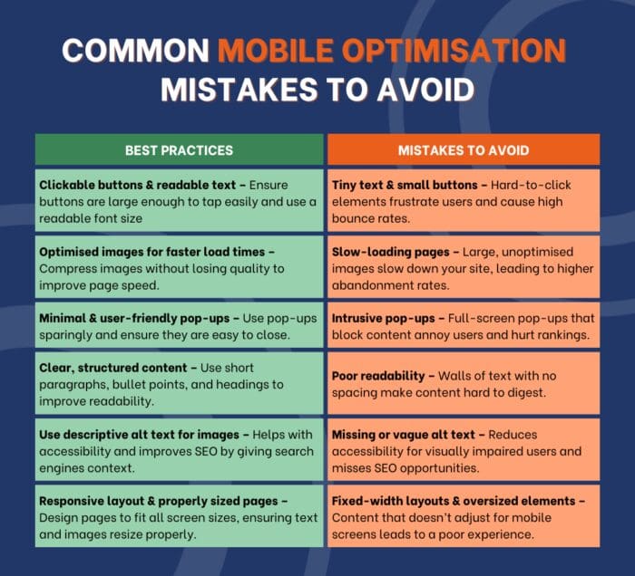
1) Use a responsive website design: Having a website that uses a responsive design allows your screen to automatically adjust to various screen sizes, from wide monitor screens to smaller smartphone screens. This provides a seamless user experience no matter the device used.
2) Optimise images: Having image files that are quite large can slow your website down, which has a negative impact on mobile SEO optimisation. Try compressing and resizing images without sacrificing quality to help improve the loading speed of your pages.
3) Improve your website response time: Having a fast page is essential for ranking in mobile search optimisation. By reducing redirects, enabling browser caching, and utilising a content delivery network, you can speed up the response and load times of your website.
4) Keep it simple: Mobile users may become irritated by a cluttered website. Use simple headlines, concise text, and a straightforward menu to simplify your design. Usability is improved by simplicity, which is essential for mobile optimisation and retaining visitors.
5) Keep your design touch-friendly: Interacting with your mobile through touch is like a modern language that most of the population knows, and if your website does not react properly to this language, it can confuse viewers and deter them from your site. It is important to ensure buttons, form fields, links, and navigation all work correctly and are the right size to tap easily. A mobile-friendly website with a touch-optimised design will help to improve engagement and support better mobile search optimisation.
Throughout this blog post, we have learned that mobile optimisation is the process of optimising your website to work on mobile phones and tablets, which adapts to any size screen and loads quickly, with efficient and simple navigation. We have discovered that mobile optimisation is important due to it providing better conversion rates, improved user experience, boosted traffic and engagement as well as providing companies with a competitive advantage.
Through using tactics such as improving your website’s response time, optimising images, keeping it simple and using a responsive website design, you’re able to start your optimisation journey. However, if you’d like some expert insight and guidance on how to optimise your website for mobile, contact us today to stay ahead of the competition with a mobile-friendly website!

Top 10 SEO Tools You Need for Your Digital Marketing Strategy
Read full blog
How To Start A Career In Digital Marketing
Read full blog